
A GIS Analysis of Traffic Accidents in the City of Apache Junction
A Graduate Research Project
Advisor and Committee Chair: Dr. Ray Huang
Committee members:
Dr. Erik Schiefer
J.C. Kliner
December 2017
Northern Arizona University
Box 15300
Flagstaff, AZ 86001
928-214-8214
Table of Contents
Abstract |
2 |
Problem Statement and Introduction |
2 |
Methodology |
3 |
Description of the dataset |
3 |
Spatial Analysis Methods Used |
5 |
Data Cleanup and Geocoding |
5 |
Data Analysis in ArcGIS |
7 |
Results |
9 |
Conclusion |
11 |
Data on the incidence of traffic accidents, especially where they occur most often and their severity, is important to city planners and decision makers as they decide on where to spend Public Works dollars and how to meet citizen safety goals. Traffic bottlenecks, unsafe intersections, and other traffic hazards are often a detriment to motorist safety and can result in diminished community living and higher health care costs. As a result, highway departments and metropolitan area elected officials initiate studies of traffic patterns in their cities to help them mitigate these issues. This report chronicles a simple analysis of a large traffic incident dataset with Geographic Information Services (GIS) tools in order to identify those areas of the City of Apache Junction that have a high incidence of traffic accidents. The ArcGIS Desktop and ArcGIS SDE suites, from ESRI, are the official GIS software platforms chosen by the city for GIS data storage, processing, and reporting. Two analysis methods supported by the ArcGIS software were used: Average Nearest Neighbor, and Ripley’s K. The author of this report was a graduate intern at the City of Apache Junction’s Development Services Department, where he was assigned to write a GIS implementation plan for the city. The plan was completed in late December 2017, and the city and the author hopes that it will make a good case for the city to finally get the budget to purchase an Enterprise License Agreement from ESRI, so that the city will gain access to the ArcGIS extensions, one of which was used to conduct this research.
Keywords: GIS, spatial, analysis, analyses, ripleys, accident, incidence, metropolitan, quantitative, research.
Incidents of traffic accidents are on the rise in the city of Apache Junction, Arizona, as they are in almost every city worldwide. The city’s summer and winter populations are rising, and the growth of development within the city’s municipal boundaries has dramatically increased over the last 5 years. The city is landlocked between federal, state, and county lands, and the city of Mesa. This means that expanding the city’s municipal boundaries is not an option, and therefore growth must be managed from within. However, some of the city’s most important arterials are beginning to feel the strain, in the form of wear and tear, the desert climate, and outdated traffic control equipment. At the same time, city Public Works budgets are decreasing. A process was needed to gain an understanding of where the most traffic accidents were occurring, so that Public Works personnel could make better informed decisions about what work to prioritize. Also, the Traffic Division of the Police Department could benefit by knowing what areas of the city to prioritize during duty shifts.
Within the last few years, the city has created a GIS department and formed a GIS steering committee to modernize their data processing operations, especially for the Development Services department, which is responsible for approving development projects, maintaining city building codes, city planning projects, and economic development. A GIS coordinator was hired, and initially assigned to the Public Works department. This position was moved to the Development Services department about 3 years ago. Within the last 6 months, the city has purchased and configured an ArcGIS SDE Enterprise server and software. The new centralized, enterprise-class GIS system has provided many benefits, including multi-user support, dataset versioning, data archiving and backup, and data verification and accuracy maintenance.
However, it was not within the city’s budget to also purchase ESRI’s ArcGIS Enterprise License Agreement, which would allow the city to use the most important add-on tools in the ArcGIS family that are not included in the basic ArcGIS packages. These tools include the Spatial Analyst, Network Analyst, and especially the Geostatistical Analyst, which contains the analytical tools necessary for conducting a research project similar to the one that this paper chronicles. The upshot is that the GIS coordinator for the city has the expertise to perform the analyses, but does not have the tools. Thus, the city needed to find another entity that did have the required hardware and software to geostatistically analyze their traffic accident data, and report the results back to the GIS department and city officials.
Description of the dataset
Shortly before the end of the paid portion of my internship, I asked my supervisor if there were any departments that had GIS data that I could analyze for this project. He told me he would ask around, and at the end of the paid portion of my internship I received an email from him, which included a point dataset from The City of Apache Junctions’ Police Department shortly after I completed the paid portion of my internship. This dataset contained traffic accident data recorded for the 5 year period 2012 – 2017. A sample of the original dataset that I received is shown below.
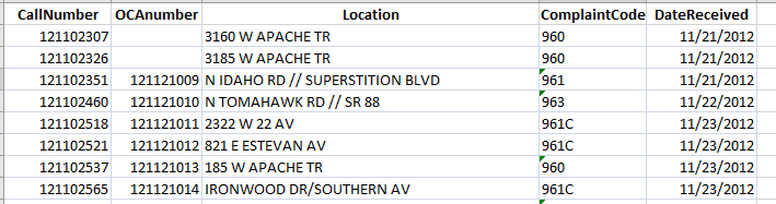
Fig. 45: A sample of the original dataset.
The data was not validated as it was being recorded. This was obvious at first glance; as you can see, some observations had missing elements, many elements had spelling and other typographical errors, and in some cases two or more observations were in fact duplicates, but the wording in one or more of them were out of order.
The dataset contained approximately 3,500 observations. There were two types of observations: address, and intersection. The street names in intersection observations were delimited by two slashes. It was apparent that I would need to do some data cleanup before attempting to geocode the observations. I was not informed as to what the CallNumber and OCAnumber elements were, but I did receive a breakdown of the Complaint Codes. These are shown below.
960 – Private Property
960A – Private Property / Officer Involved
960C – Private Property / H&R
960D – Private Property / DUI
961 – Non-Injury
961A – Non-Injury / Officer Involved
961C – Non-Injury / H&R
961D – Non-Injury / DUI
962 – Injury
962A – Injury / Officer Involved
962C – Injury / H&R
962D – Injury / DUI
963 – Fatality
963A – Fatality / Officer Involved
963C – Fatality / H&R
963D – Fatality / DUI
Fig. 45: Breakdown of Complaint Code nominal data element.
Spatial Analysis Methods Used
It was recommended to me that I use the following spatial analysis methods: Nearest Neighbor, and Ripley’s K. Both of these point pattern analysis methods measure a dataset’s degree of clustering, dispersion, and randomness. This statistic can be important when testing the dataset for normality (is it a normal distribution).
The Nearest Neighbor function calculates average distances between point neighbors to determine if the observations in an input dataset are randomly distributed and if not, the degree of clustering or dispersion. Its main output is a ratio of observed and expected average distance between nearest neighbors; if this ratio approaches or is equal to 1, the dataset is random. If it is less than 1, the dataset has a degree of cluster (is more clustered than a random pattern); if it is greater than 1, the dataset has a degree of dispersion (is more dispersed than a random pattern).
The Ripley’s K function is an advanced global analysis method that can also capture 2nd order local variations in the data. It can also show its degrees of randomness, clustering, and dispersion over multiple spatial scales. It first sets an initial lag distance, then uses an iterative procedure to count points and measure the space between them. Eventually, the method comes up with a probability function of points occurring at varying lag distances. The goal of Ripley’s K analysis is to produce a probability function K(h) that approaches or equals . If the values of K(h) (number of points at lag distance h) approach proportionality to the radius of the circle the dataset can be considered random. If the observed values of the K(h) function appear to be higher than the dataset exhibits a clustered pattern; if lower, the dataset has a degree of dispersal.
Data Cleanup and Geocoding
The original dataset was contained in a Microsoft Excel worksheet. I imported the data into Microsoft Access in order to standardize the data types and for data cleanup and normalization. I applied an ID to keep the observations unique and in case the element was required during spatial analysis. Once the data was in Access, I began by running a query that would update a type code to “I” if the address of the accident contained the intersection delimiters:
UPDATE Accidents SET LocationTypeCode = "I"
WHERE InStr(1,[FullLocation],"//") > 0;
Then I updated the type code for the rest of the observations to “A”, and replaced the “//” delimiter to @. To standardize the addresses of the address observations, I created four additional elements in the dataset: address number, direction indicator, street name, and suffix. I then used the following query to update these fields from the original address element, called FullLocation:
UPDATE Accidents
SET AddressNumber = CLng(Left([FullLocation],InStr(1,[FullLocation]," ")-1)),
DirectionIndicator = CStr(Mid$([FullLocation],InStr(1,[FullLocation]," ")+1,1)),
Suffix = CStr(Right$([FullLocation],Len([FullLocation])-InStrRev([FullLocation]," "))),
StreetName =
Right$(Left$([FullLocation],InStrRev([FullLocation]," ")
Len(Left$([FullLocation],InStrRev([FullLocation]," ")-1))-
InStrRev(Left$([FullLocation],InStrRev([FullLocation]," ")-1)," "))
WHERE LocationTypeCode = "A";
I then added City and State fields, and began inspecting the data for inconsistencies. For example, “AV” strings were updated to be “AVE” strings, incorrect suffixes (“RD” when the official suffix for the address is “BLVD”) were fixed, and other miscellaneous typographical errors were corrected. The dataset observations were now ready to be geocoded.
I used a query to generate a text file with about 340 unique addresses from the dataset, and used Dr. Huang’s Google Geocoder to geocode them. Since Google apparently restricts the number of addresses to be geocoded to 10 per transaction, I had to use a utility to split the original text file into 34 text files with 10 addresses each, then manually load each one into the geocoder, geocode the addresses, save the results into the same textfile, then close and reopen the geocoder for the next textfile. Once all the text files had been processed, I concatenated them all into 1 text file, removed blank and extra header lines, added Latitude and Longitude elements to the dataset in Access, and updated those elements with the data in the text file. The dataset was now ready to be analyzed. A sample of the dataset in Access ready for analysis in ArcGIS is shown below.

Fig. 45: A view of the dataset observations ready for analysis in ArcGIS.
Data Analysis in ArcGIS
In addition to the dataset, the GIS coordinator for the City of Apache Junction also sent me some base data and a base map that included the city’s municipal boundary. Once the data was imported into ArcMap, I used the Display X,Y function to get the data into the map. After inspecting the resulting full extent of the map, however, I noticed that the scale of the map became very, very small. That was because the street names of some of the intersection observations were so ambiguous, either due to typographical errors or differences from the official version of the street name, that after geocoding the resulting point location was in a few cases hundreds of miles from the City of Apache Junction city limits! Thus, before data analysis could be conducted, these spurious outliers had to be either corrected or removed. I was only able to correct perhaps half a dozen; the rest I simply removed. Below is a snapshot of the map of the dataset ready for analysis.
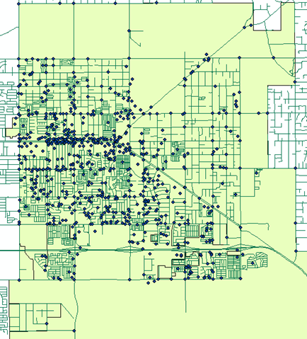
Fig. 45: A view of the accidents layer ready for analysis.
Coordinates generated by Google are in the North American HARN Geographic Coordinate System. The standard coordinate system used by the City of Apache Junctions’ GIS department is NAD 1983 HARN StatePlane Arizona Central FIPS 0202, so I re-projected the dataset. I had to save the points layer to a shape file first, then re-add the shape file to the map, as that is a requirement for the Project tool. The data was now properly prepared for the Ripley’s K analysis function.
To find a proper value for the functions’ number of distance bands option, I measured the radius of the municipal boundary, then calculated the number of distance bands, rounding down to 400 intl feet (m = meters; ‘ = Intl feet):
) 6824.355m = 133.388m * n ==> 51 bands
) 133.388m * 3.28083 = 437.62335204' ==> band increment
I chose the Simulate_outer_boundary_values option for the boundary correction method option because there are a lot of points in the dataset that are located on the municipal boundary. At first I tried the Municipal Boundary as the Study Area Method, but it was not properly configured for the Ripleys tool, so I chose Minimum_Closing_Rectangle instead.
Due to the very large number of observations in the data set, I did a test run with no permutations to see how long the Ripley’s K function would take to complete. It came back in a reasonable amount of time – 3 minutes – so for the next run I set the number of permutations to 9. The run finished in about an hour and 15 minutes. For both runs, I left the Beginning_Distance option blank.
Running the Nearest Neighbor function was significantly less complex. I simply chose the input layer and used Euclidean_Distance as the distance method, and it completed in a couple of minutes. Because I ran this tool before I had re-projected the data, it used chordal distances, but since the study area is far smaller than 30 degrees I assumed that it would run OK.
Results
The following figures show the resulting output of the Average Nearest Neighbor and Ripley’s K function runs.
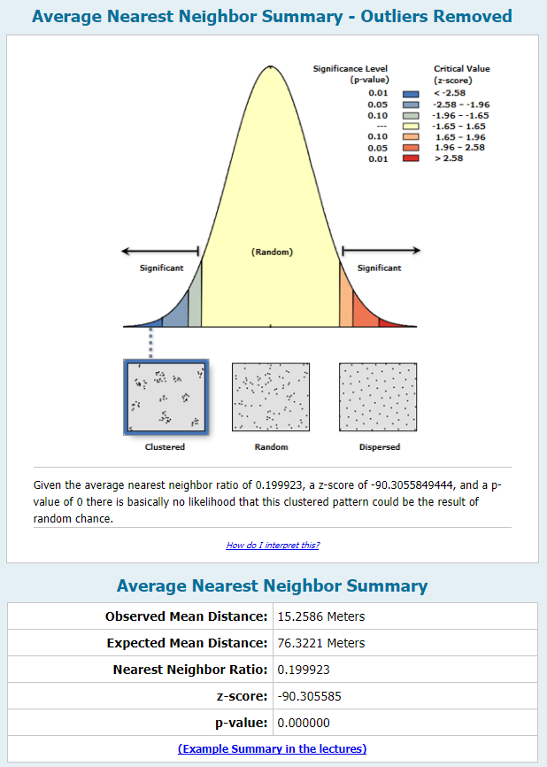
Fig. 45: Average Nearest Neighbor function output.
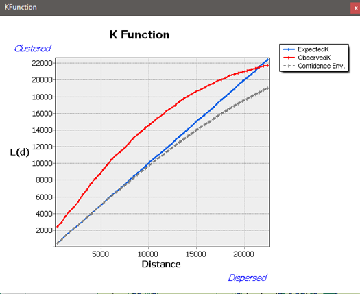
Fig. 45: Ripley’s K function with 9 permutations and a 400’ distance increment.
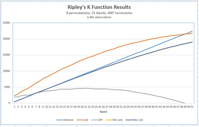
Fig. 45: Excel chart of the Ripley’s K function results.
Conclusion
The results show a very high degree of clustering, except for areas close to the municipal boundary. This correlates to how the point dataset looks on the map. There is a strip of extreme clustering along Apache Trail, which is the city’s main thouroughfare, which is to be expected. Also, there is an arm of clustering running into the southest part of the city. It is suspected though, that an important part of why there is such a high degree of clustering is the sheer number of observations in the dataset, within such a small geographic area. If this project were to become part of a larger operation, for example part of my Directed Study project, I would most likely split the dataset into several smaller areas of the city, and analyze each subset separately.